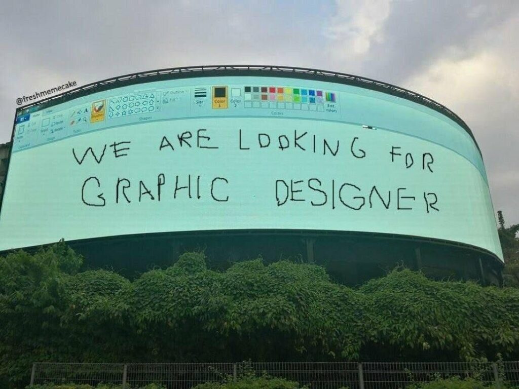
Blog/Inspired graphic designer advert
4th March 2021
If you’re a designer (graphic or otherwise) and you’re looking for an employer or client, the dream is to find one who allows you the creative freedom to take an idea and run with it, the ones that aren’t afraid to take a chance, those with personality and humour, that don’t take themselves overly serious and that know how and when to push the limits of a brand and when to play it safe.
The last thing you want is to be given a rigid brief and a rigid set of guidelines and be asked to come up with something ‘creative’, only the logo has to go in the bottom left corner, the font has to be Agenda, there has to be a gradient from colour A bottom left to colour B top right and you have the choice of three photos to use, only one is the wrong proportions and another is the wrong colour profile so that’s out too.
Basically, the ad designs itself and the designer’s creative urges remain unfulfilled, and you get the creative you’ve seen a thousand times before.
So when an ad like this comes along…

…you know the company concerned not only knows the job, has personality and they operate with a degree of creative freedom (and I dare say has a decent budget to work with!). This is the holy grail of employers, and said company is likely to have people queuing round the block to apply for the position.
It’s the most effective job ad I think I might ever seen, and if they didn’t have the cream of the crop to pick from then I’d be very surprised.
Heck, if I didn’t love writing these blogs so much I might have been tempted to send in my cv myself!
(Okay, so it might be a spoof, but the above still applies. Give your designers the creative freedom to do what they’re best at and they might surprise you with what they produce. Ask them to design by numbers and not only will they churn out the same turgid old designs but they will become steadily more frustrated and you’ll soon be left with a designer shaped hole in your workforce)